Link to Jupyter Notebook at the end of this post.
The 2021 yield data from all of the treatments is housed in an excel file called “2021 Yield”.
Research Question
Did treatment have a significant effect on yield in 2021?
If so, how did the different treatments compare?
Why does this matter?
Our team is interested in studying the effects of perennial groundcover implementation on water quality. However, even if perennial groundcover had an amazing effect on water quality and drastically decreased nutrient export, it would not gain traction with farmers it lead to reduced yields. Therefore, we also need to understand how perennial groundcover effects yield compared to conventional corn and other cover crop systems.
Project Workflow
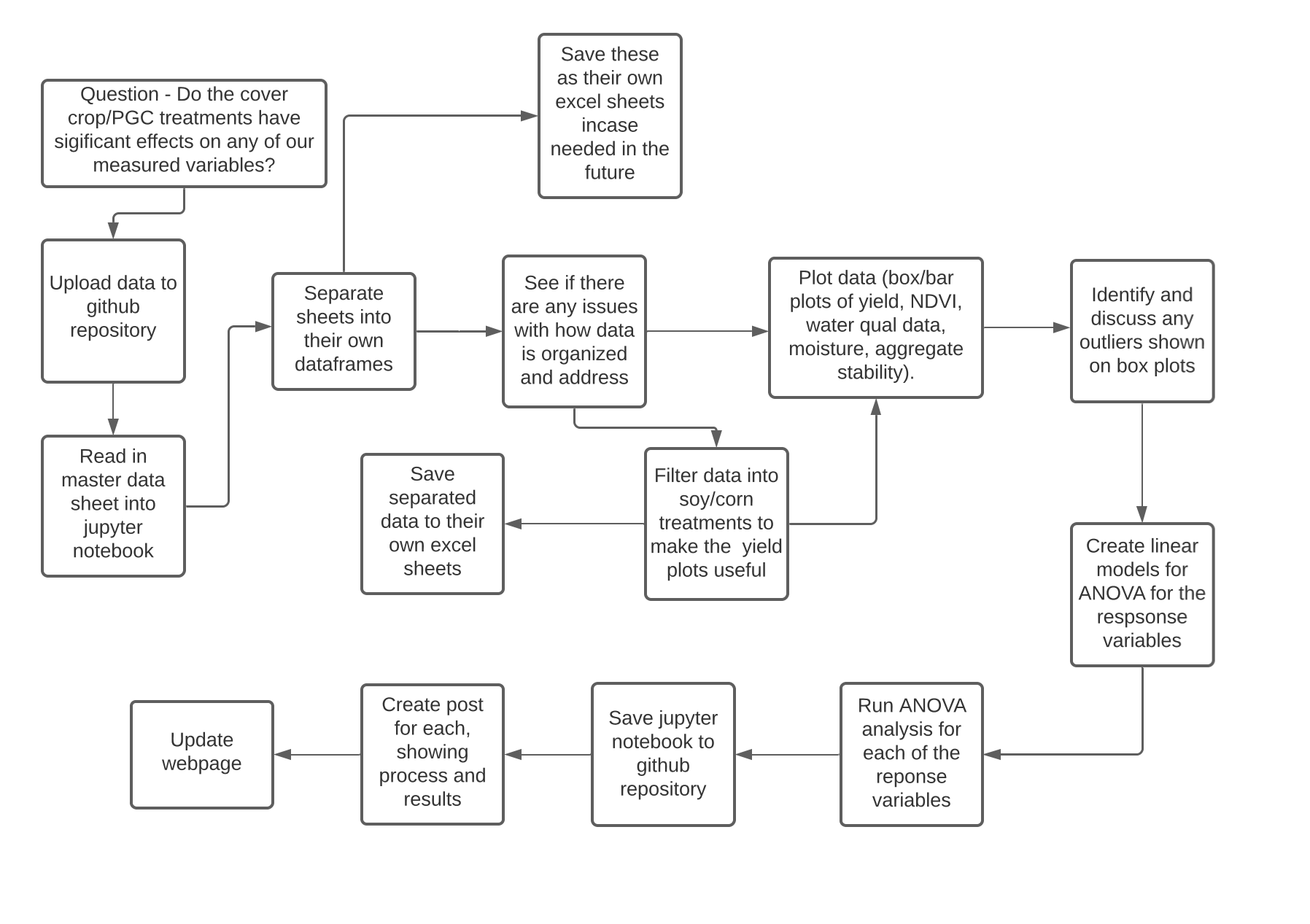
In this post, we are exploring the effects of treatment on 2021 yield.
Importing the data
yield_data = pd.read_excel("2021 Yield.xlsx")
The data looks like this:
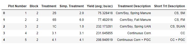
I organized this data in a format that makes it easy for me to use from the beginning, so there isn’t much need for changes to its structure.
Visualizing the data
Box Plots
ax = sns.boxplot(x = "Treatment", y = "Yield (avg; bu/ac)", data = yield_data)
plt.savefig('all_yield_box.png')
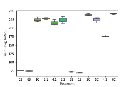
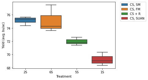
I realized it doesn’t work to have all the yields on the same plots because some treatments are soybeans and others are corn, so yields are very different.
Subsetting the data
corn_only = yield_data[yield_data['Treatment'].str.contains('1C|2C|3.1|3.2|4.1|4.2|5C|6C')]
ax = sns.boxplot(x = "Treatment", y = "Yield (avg; bu/ac)", data = corn_only, hue = 'Short Trt Description', dodge = False)
plt.legend(bbox_to_anchor=(1.05, 1), loc=2, borderaxespad=0.)
plt.savefig('corn_yield_box.jpg', bbox_inches='tight')
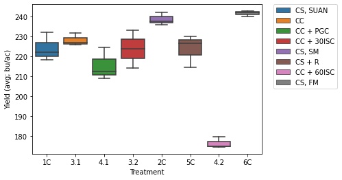
Legend Explanation
| Code | Explanation |
|---|---|
| CS, SUAN | Corn/Soy Rotation with Spring UAN |
| CC | Continuous Corn |
| CC + PGC | Continuous Corn with Perennial Groundcover |
| CC + 30ISC | Continuous Corn with 30 inch rows and Interseeded Cover Crop |
| CS, SM | Corn/Soy Rotation with Spring Manure |
| CS + R | Corn/Soy Rotation with Cereal Rye Cover Crop |
| CC + 60ISC | Continuous Corn with 60 inch rows and Interseeded Cover Crop |
| CS, FM | Corn/Soy Rotation with Fall Manure |
Soy
ax = sns.boxplot(x = "Treatment", y = "Yield (avg; bu/ac)", data = soy_only, hue = 'Short Trt Description', dodge = False)
plt.legend(bbox_to_anchor=(1.05, 1), loc=2, borderaxespad=0.)
plt.savefig('soy_yield_box.jpg', bbox_inches='tight')
Bar Plots
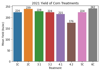
Corn Yield by Treatment
corn_means = pd.DataFrame(corn_only.groupby('Treatment')['Yield'].describe()['mean'])
corn_means = corn_means.reset_index()

ax = sns.barplot(x = 'Treatment', y = 'mean', data = corn_means)
ax.set_title('2021 Yield of Corn Treatments')
ax.set(xlabel='Treatment', ylabel='Mean Yield (bu/ac)')

#for annotating
for p in ax.patches:
             ax.annotate("%.0f" % p.get_height(), (p.get_x() + p.get_width() / 2., p.get_height()),
                 ha='center', va='center', fontsize=10, color='black', xytext=(0, 5),
                 textcoords='offset points')

plt.savefig('corn_bar.jpg', bbox_inches='tight')
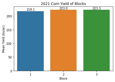
Corn Yield by block
corn_block_means = pd.DataFrame(corn_only.groupby('Block')['Yield'].describe()['mean'])
corn_block_means = corn_block_means.reset_index()
ax = sns.barplot(x = 'Block', y = 'mean', data = corn_block_means)
ax.set_title('2021 Corn Yield of Blocks')
ax.set(xlabel='Block', ylabel='Mean Yield (bu/ac)')

#for annotating
for p in ax.patches:
             ax.annotate("%.1f" % p.get_height(), (p.get_x() + p.get_width() / 2., p.get_height()),
                 ha='center', va='center', fontsize=10, color='black', xytext=(0, 5),
                 textcoords='offset points')

plt.savefig('corn_block_bar.jpg', bbox_inches='tight')
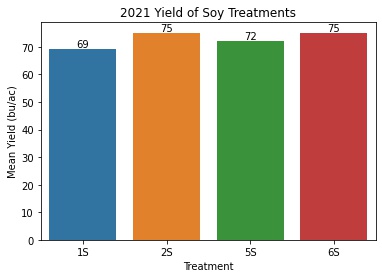
Soy Yield by Treatment
soy_means = pd.DataFrame(soy_only.groupby('Treatment')['Yield'].describe()['mean'])
soy_means = soy_means.reset_index()

ax = sns.barplot(x = 'Treatment', y = 'mean', data = soy_means)
ax.set_title('2021 Yield of Soy Treatments')
ax.set(xlabel='Treatment', ylabel='Mean Yield (bu/ac)')

#for annotating
for p in ax.patches:
             ax.annotate("%.0f" % p.get_height(), (p.get_x() + p.get_width() / 2., p.get_height()),
                 ha='center', va='center', fontsize=10, color='black', xytext=(0, 5),
                 textcoords='offset points')

plt.savefig('soy_bar.jpg', bbox_inches='tight')
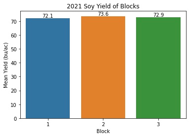
Soy Yield by Block
soy_block_means = pd.DataFrame(soy_only.groupby('Block')['Yield'].describe()['mean'])
soy_block_means = soy_block_means.reset_index()

ax = sns.barplot(x = 'Block', y = 'mean', data = soy_block_means)
ax.set_title('2021 Soy Yield of Blocks')
ax.set(xlabel='Block', ylabel='Mean Yield (bu/ac)')

#for annotating
for p in ax.patches:
             ax.annotate("%.1f" % p.get_height(), (p.get_x() + p.get_width() / 2., p.get_height()),
                 ha='center', va='center', fontsize=10, color='black', xytext=(0, 5),
                 textcoords='offset points')

plt.savefig('soy_block_bar.jpg', bbox_inches='tight')
Corn ANOVA
I first need to test that the assumptions for ANOVA, independence, normality, and homogeneity of variance, are satisfied.
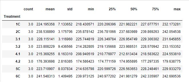
Treatment Summary
Checking for Normality
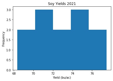
plt.hist(x='Yield', bins = 'auto', data = corn_only)
plt.title("Corn Yields 2021")
plt.xlabel('Yield (bu/ac)')
plt.ylabel('Frequency')
plt.savefig('Corn Histogram.jpg', bbox_inches='tight')
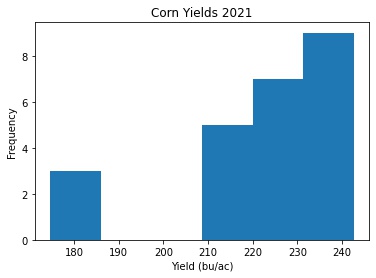
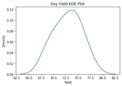
Not looking very normally distributed. A histogram might not be the best way to see it. I’ll make a kernel density estimate plot (Link to Doumentation) to look at it another way.
sns.kdeplot(data=corn_only, x="Yield")
plt.title('Corn Yield Kernel Density Plot')
plt.savefig('corn_yield_kde.jpg', bbox_inches='tight')
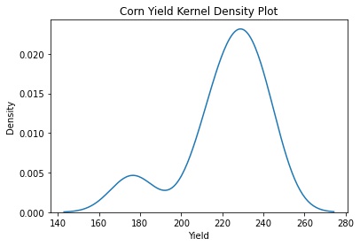
Clearly we have some outliers.
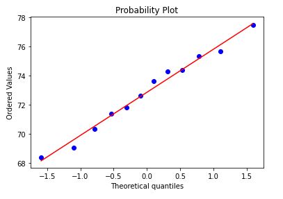
stats.probplot(corn_only['Yield'], dist="norm", plot=plt)
plt.show()
plt.savefig('corn_yield_probplot', bbox_inches='tight')
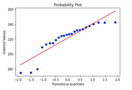
Certainly not the most normally distributed, but I’m going to move along.
Homogeneity of Variances
Null: Variances are the same across treatments
Alternative: Variances are not the same across treatments
Following this tutorial: Barletts and Levenes Tests
Bartlett’s Test of Homogeneity of Variances
from scipy.stats import bartlett

# subsetting the data:
trt1 = corn_only.query('Treatment == "1C"')['Yield']
trt2 = corn_only.query('Treatment == "2C"')['Yield']
trt31 = corn_only.query('Treatment == "3.1"')['Yield']
trt32 = corn_only.query('Treatment == "3.2"')['Yield']
trt41 = corn_only.query('Treatment == "4.1"')['Yield']
trt42 = corn_only.query('Treatment == "4.2"')['Yield']
trt5 = corn_only.query('Treatment == "5C"')['Yield']
trt6 = corn_only.query('Treatment == "6C"')['Yield']

# Bartlett's test in Python with SciPy:
stat, p = bartlett(trt1, trt2, trt31, trt32, trt41, trt42, trt5, trt6)

# Get the results:
print(stat, p)
T = 8.236102945085667
p = 0.3122358533181093
The p-value is high, so you can assume the variances are the same.
Levene’s Test of Equality of Variances
This is preferred for non-normal data.
from scipy.stats import levene

# Create three arrays for each sample:
trt1 = corn_only.query('Treatment == "1C"')['Yield']
trt2 = corn_only.query('Treatment == "2C"')['Yield']
trt31 = corn_only.query('Treatment == "3.1"')['Yield']
trt32 = corn_only.query('Treatment == "3.2"')['Yield']
trt41 = corn_only.query('Treatment == "4.1"')['Yield']
trt42 = corn_only.query('Treatment == "4.2"')['Yield']
trt5 = corn_only.query('Treatment == "5C"')['Yield']
trt6 = corn_only.query('Treatment == "6C"')['Yield']

# Levene's Test in Python with Scipy:
stat, p = levene(trt1, trt2, trt31, trt32, trt41, trt42, trt5, trt6)

print(stat, p)
W = 0.6584854455470804
p = 0.7032800804487055
p-value is high, so you can assume the variances are the same.
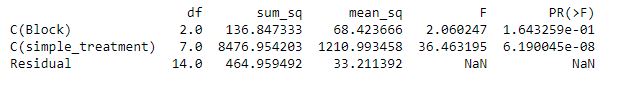
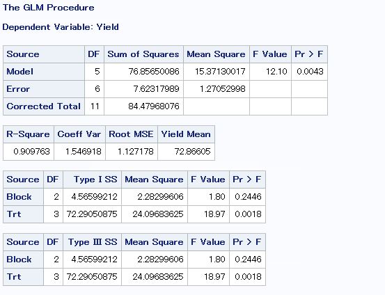
ANOVA
Checking to see if treatment or block had a significant effect on corn yields in 2021.
corn_only = corn_only.rename(columns={"Simp. Treatment": "simple_treatment"})

model = ols('Yield ~ C(Block) + C(simple_treatment)', data = corn_only).fit()

aov_table = sm.stats.anova_lm(model)

print(aov_table)
This matches what I get using SAS:
proc glm data = A;
class Block Trt;
model Yield = Block Trt;
random Block/test ;
run;
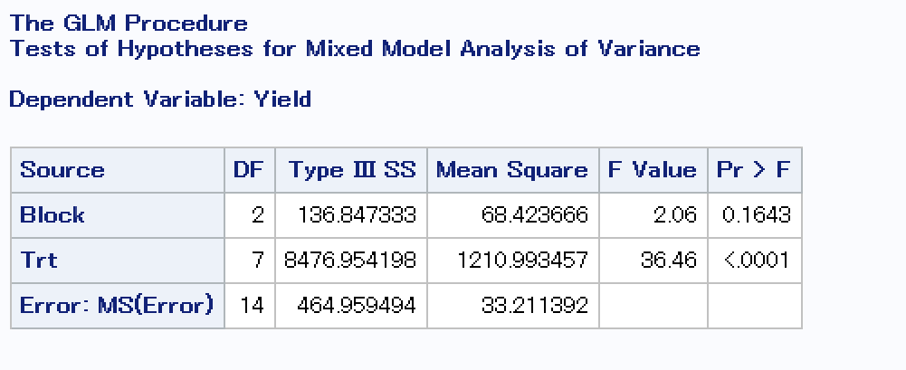
It looks like treatment definitely had an effect on corn yields in 2021 and block did not.
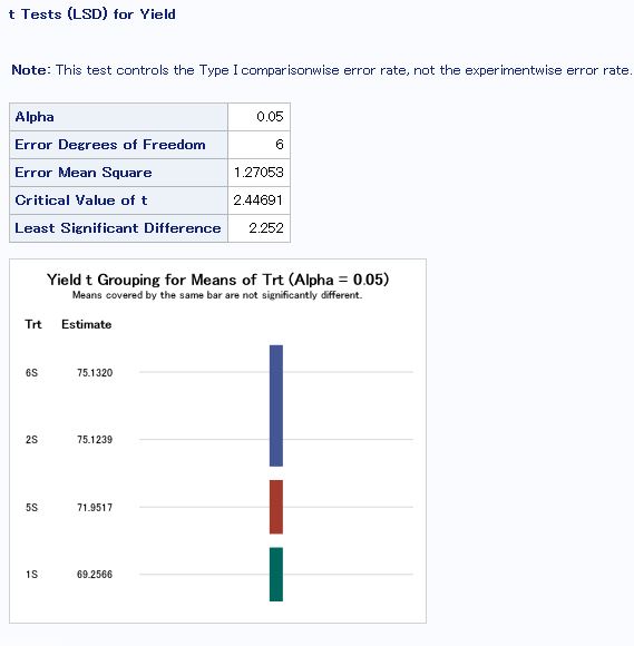
Least Significant Difference in SAS
To see which treatments’ means are different from each other.
proc glm data = A;
class Block Trt;
model Yield = Block Trt;
means Trt/lsd;
run;
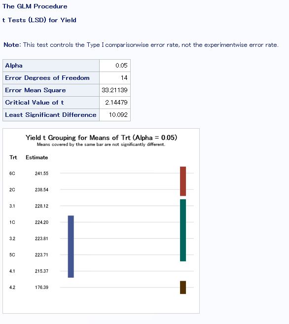
- Treatment 4.2 is different from all other treatments, which is expected because of an error in the seeding chart for this treatment leading to a lower plant density than desired.
- The PGC treatment (4.1) was significantly different than the control (3.1), with PGC having a 12.75 bu/ac decrease from the control.
- The corn/soy rotations with manure applied and no cover crops yielded the best (2C and 6C).
Soy ANOVA
Following the same steps as above.
model = ols('Yield ~ C(Block) + C(simple_treatment)', data = soy_only).fit()

aov_table = sm.stats.anova_lm(model)

print(aov_table)
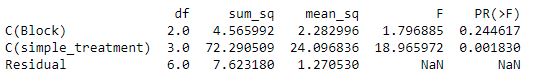
In SAS
- Again, the treatments with no cover crops yielded the best (6S and 2S)
- The cereal rye treatment (5S) saw an approximately 3 bu/ac decrease in soy yield
Discussion
In 2021, we saw no effect from block and a significant effect from treatment in both corn and soybeans. The 60 inch rows + interseeded cover crop treatment (4.2) was signifcantly different than all other treatments. This is probably due to the seeding rate error that led to a lower plant density than desired. The PGC treatment had a 12.75 bu/ac decrease in yield compared to the control. The treatments with no cover crops and manure applied yielded the best. Corn had an average price of $5.55/ bu in 2021 (Source), so the PGC treatment would correspond to over $70 lost per acre.
For the soybean treatments, we again saw that the treatments with no cover crops had the best yields. The cereal rye treatment had a 3 bu/ac ($40/ac) decrease in yield.
To do this analysis, I used data wrangling techniques to subset corn and soybean data into two different data frames and rename the columns of my data frames into more concise and usable names. I used the seaborn and matplotlib packages to visualize the data. I was able to follow online tutorials to utilize scipy stats packages to test ANOVA assumptions and complete the analysis. I chose to use ANOVA because I was interested in the effects of treatment on the yield. At this point, I do not need to use any prediction or classification analyses, but possibly this will be useful in the future when I have larger datasets. I also used github in this project for the website and housing my code and data.
This analysis attains the FAIR principles because the data is fully available on my github repository. The code for making all of the figures, implementing the models, and exploring the data is also fully available, making the analysis reproducible for anyone interested. The data is organized in a way that does not require a lot of extra processing before analyzing it, so it should be interoperable between different computer programs.
Full Notebook
nb viewer